Data
The collection of raw facts and figures is called data. Data is an unprocessed entity which is given as an input to the model. Data on its own doesn’t have any meaning, it requires some amount of processing to make it meaningful.
For example: 560095 could be a population of a place, zip code, an amount, an ID, or anything else but Rs. 560095 clearly indicates monetary value.
Here, 560095 is data whereas Rs. 560095 is a piece of information as it provides definite meaning.
Knowledge is hidden potential patterns that provide meaningful insights which could help in decision-making.
Research is the systematic process of extracting the knowledge hidden in the data.
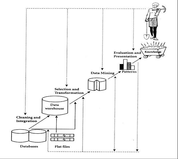
In order to extract hidden knowledge, we follow the KDD process.
Types of dataset:
There could be three types of datasets namely univariate, bivariate, and multivariate.
If the dataset consists of only one variable then it is called Univariate (example: dataset containing only height) If the dataset consists of two variables then it is called Bivariate (example: dataset containing weight and height). And if the dataset consists of more than two variables then it is called Multivariate (example: dataset containing age, gender, weight and height)
Types of data

Understanding your data: Exploratory Data Analysis (EDA)
EDA is a preliminary investigation of data to identify its nature, anamolies (if any) and to test the hypothesis so that one can figure out its suitable usage. EDA is done using simple statistical techniques and/or visualization methods that can provide better understanding of data.
Why EDA is important?
EDA is used by data scientists/ Analysts/ Data Practitioners to analyze and investigate data sets and summarize their main characteristics.
EDA is primarily used to see what data can reveal beyond the formal modeling or hypothesis testing task and provides a better understanding of data set variables and the relationships between them.
It is a good practice to understand the data first and try to gather as many insights from it. EDA is all about making sense of the data in hand, before getting them dirty with it.
Which are the techniques used in EDA?
The techniques used in EDA can be broadly classified as statistical techniques and graphical techniques.
Statistical Techniques
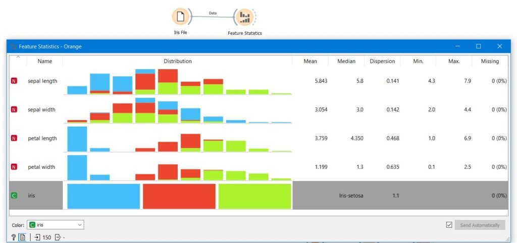
Feature Statistics: Feature statistics include a basic summary of the features which include count, mean, median, mode, min, and max values of numeric data. Feature statistics help us to identify the range of features, deviation from the mean, most repeated values, etc. With the help of feature statistics, one can decide whether scaling of data is required or not. Outliers exist are not and missing values exist or not.
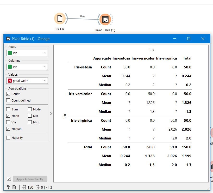
Pivot table: A Pivot Table is a powerful tool to calculate, summarize, and analyze data that lets you see comparisons, patterns, and trends in your data.
Example: Let us assume that we have five years of data pertaining to the sales of stationery items, through the pivot table one can find out what is the performance of a company year wise. There may be some patterns for example every year in the month of May Sales of stationery items shoot up. What is the yearly trend of sales of stationary items etc.
Correlation: Correlation is a statistical measure (expressed as a number) that describes the size and direction of a relationship between two or more variables. However, does not automatically mean that the change in one variable is the cause of the change in the values of the other variable. The range of correlation is -1 to +1
Covariance: Covariance is a statistical measure (expressed as a number) that describes th direction of a relationship between two variables. Covariance is a clear measure of cause and effect. i.e. change in one variable is the cause of the change in the values of the other variable. The range of covariance is -inf to +inf. The greater this number, the more reliant the relationship. Positive covariance denotes a direct relationship and is represented by a positive number and viceversa. Covariance is great for defining the type of relationship, but it’s terrible for interpreting the magnitude.
NOTE: Covariance shows you how the two variables differ, whereas correlation shows you how the two variables are related.
Applications of covariance:
- Covariance is used in Biology – Genetics and Molecular Biology to measure certain DNAs.
- Covariance is used in the prediction of amount investment on different assets in financial markets
- Covariance is widely used to collate data obtained from astronomical /oceanographic studies to arrive at final conclusions
- In Statistics to analyze a set of data with logical implications of principal component we can use covariance matrix
- It is also used to study signals obtained in various forms.
Applications of correlation:
- Time vs Money spent by a customer on online e-commerce websites Comparison between the previous records of weather forecast to this current year.
- Widely used in pattern recognition
- Raise in temperature during summer v/s water consumption amongst family members is analyzed
- The relationship between population and poverty is gauged
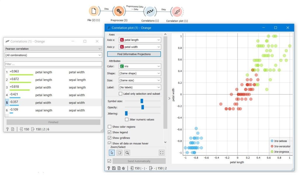
Graphical techniques
Bar graph, Pie Chart, Line Graph, Scatter Plot,Box Plot, Histogram etc
Bar graph: A bar graph is a graph that shows complete data with rectangular bars and the heights of the bars are proportional to the values that they represent. The bar graph is the best means to check whether our dataset is balanced dataset or imbalanced data.
A dataset is said to be an imbalanced dataset if the proportion of the instances of the classes are unequal.
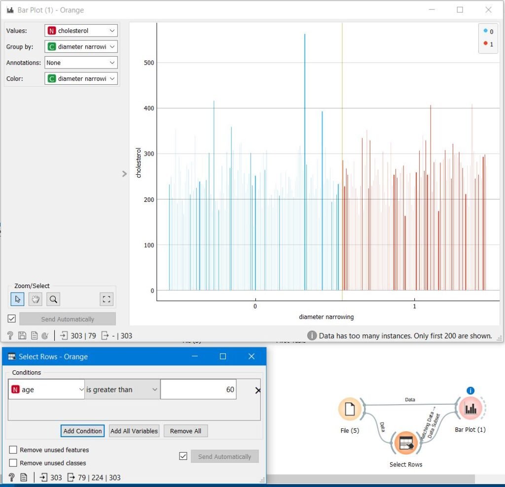
Pie Chart: A pie chart (or a circle chart) is a circular statistical graphic, which is divided into slices to illustrate numerical proportion of the data. pie chart is the best means to identify the proportion of missing values and outliers in the dataset.
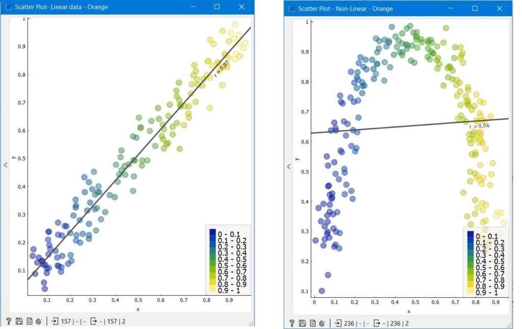
Scatter Plot: Scatter plots are graphs that present the relationship between two variables in a data set. A Scatter plot in EDA helps to understand the relationship between two variables.
The scatter plot explains the correlation between two attributes or variables. It represents how closely the two variables are connected. There can be three such situations to see the relation between the two variables –
Positive Correlation Negative Correlation No Correlation
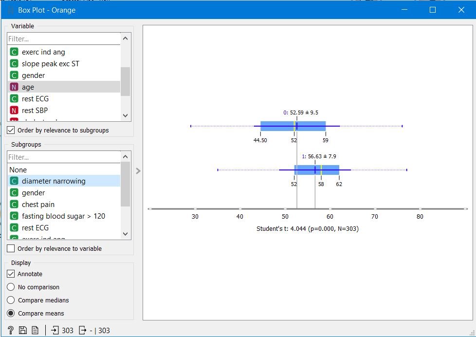
Box Plot: A box and whisker plot—also called a box plot is a plot used to display the five-number summary of a set of data.
The five-number summary is the minimum, first quartile, median, third quartile, and maximum. A box plot is a method for graphically demonstrating the locality, spread and skewness groups of numerical data Box plot helps us to identify the outliers. Any points lieing after the top and botton whiskers are considered to be the outliers.
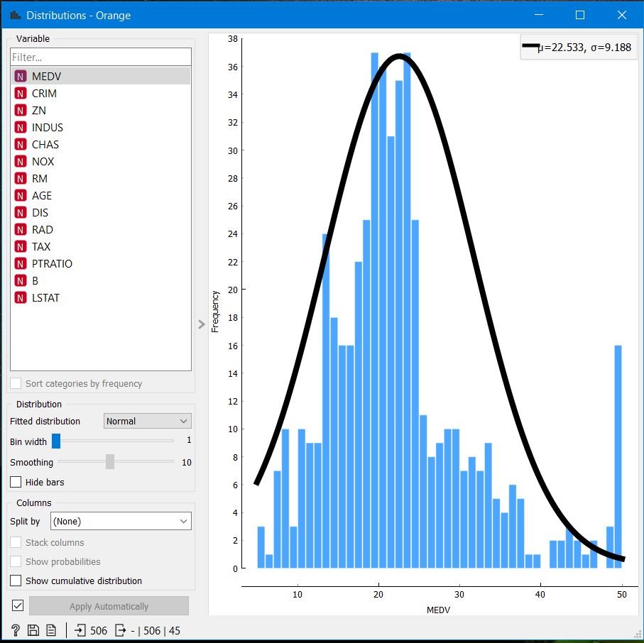
Histogram: A histogram is a bar graph-like representation of data that buckets a range of classes into columns along the horizontal x-axis. The vertical y-axis represents the number count or percentage of occurrences in the data for each column.
A histogram can be used to visualize patterns of data distributions. i.e to identify which type of data distribution our data follows. If a data follows a normal distribution then any parametic method can be used for modelling the data. Eg: Naive Bayes works best when data follows normal distribution.
WHEN TO USE A HISTOGRAM? Use a histogram when-
The data are numerical You want to see the shape of the data’s distribution, especially when determining whether the output of a process is distributed approximately normally Analyzing whether a process can meet the customer’s requirements Analyzing what the output from a supplier’s process looks like Seeing whether a process change has occurred from one time period to another Determining whether the outputs of two or more processes are different You wish to communicate the distribution of data quickly and easily to others
